

Case Study
Experience Design
The challenge was to identify a well-known SaaS platform and improve key experiences.
The challenge was to identify a well-known SaaS platform and improve key experiences.
The challenge was to identify a well-known SaaS platform and improve key experiences.
The challenge was to identify a well-known SaaS platform and improve key experiences.
About
Booking.com
About
Booking.com
About
Booking.com
About
Booking.com
About
Booking.com
Booking.com is one of the world’s largest online travel platforms, allowing users to search, compare, and book accommodations across hotels, apartments, and vacation rentals.
Booking.com is one of the world’s largest online travel platforms, allowing users to search, compare, and book accommodations across hotels, apartments, and vacation rentals.
Overview
Research
How I started
How I started
How I started
My first step was to understand the current experience on Booking.com and identify where users struggle the most. I explored the platform end-to-end, focusing on the search results and property detail pages, and analyzed user reviews and forum discussions to uncover recurring pain points around clutter, filters, and decision-making.
My first step was to understand the current experience on Booking.com and identify where users struggle the most. I explored the platform end-to-end, focusing on the search results and property detail pages, and analyzed user reviews and forum discussions to uncover recurring pain points around clutter, filters, and decision-making.
My Role
Reduced friction, solved key usability challenges, and redesigned critical interfaces.
Reduced friction, solved key usability challenges, and redesigned critical interfaces.
My Team
Team - Ashish (Designer), Daniel (Mentor)
Team - Ashish (Designer), Daniel (Mentor)
Problem Identification

"The filter on the category page creates confusion."

"The booking process felt stressful due to overwhelming information"

"The category information felt unstructured"

"Some feedback was unclear and hard to understand."
Validated through user interviews and quantitative research
Product Pain Points
Product Pain Points
Product Pain Points
Category Page - Most users struggle to scan results due to poor hierarchy, hard-to-find filters, and dense content.
Property Detail Page - Critical information is visually unstructured, making booking decisions slow; During interviews, users took 4 - 5 minutes to feel confident
Category Page - Most users struggle to scan results due to poor hierarchy, hard-to-find filters, and dense content.
Property Detail Page - Critical information is visually unstructured, making booking decisions slow; During interviews, users took 4 - 5 minutes to feel confident
Research Overview
+
Interview
Conducted 7+ interviews during the research phase to understand user pain points.
Conducted 7+ interviews during the research phase to understand user pain points.
+
Survey
Conducted 21+ surveys to validate the design, and improve the overall experience
Conducted 21+ surveys to validate the design, and improve the overall experience
+
Mentor Call
Had the opportunity to review and improve the design with my mentor.
Had the opportunity to review and improve the design with my mentor.
+
Timeline
The timeline for this product delivery was 2 months and 15 days.
The timeline for this product delivery was 2 months and 15 days.
Project goal
Project Goal
Project Goal
Project Goal
The goal of this project was to redesign key parts of the Booking.com experience by reducing cognitive overload and improving information hierarchy. The focus was on making search results, filters, and property details clearer and easier to scan so users can make faster and more confident booking decisions.
The goal of this project was to redesign key parts of the Booking.com experience by reducing cognitive overload and improving information hierarchy. The focus was on making search results, filters, and property details clearer and easier to scan so users can make faster and more confident booking decisions.


Design Insight
User Insight
User feedback from interviews and forums highlighted frustration with dense information, buried key details, and slow decision-making. The redesign translates these insights into a clearer, more scannable experience.
User feedback from interviews and forums highlighted frustration with dense information, buried key details, and slow decision-making. The redesign translates these insights into a clearer, more scannable experience.
Based on Mentor guidelines
Design Principles Applied
Design Principles Applied
Design Principles Applied
Cognitive Load Reduction
Clear Visual Hierarchy
Progressive Disclosure
Consistency & Familiarity
Trust & Clarity
Cognitive Load Reduction
Clear Visual Hierarchy
Progressive Disclosure
Consistency & Familiarity
Trust & Clarity
Solution
Category Page
Category Page
Category Page
Content was restructured and visually prioritised.
Users can now scan results efficiently, identifying key information like price, ratings, and amenities without confusion.
Filters and badges were reorganised to reduce cognitive load and eliminate unnecessary visual noise.
Content was restructured and visually prioritised.
Users can now scan results efficiently, identifying key information like price, ratings, and amenities without confusion.
Filters and badges were reorganised to reduce cognitive load and eliminate unnecessary visual noise.


Product Page
Product Page
Product Page
Critical information was prioritized and clearly distinguished from secondary details.
Design improvements allow users to scan quickly, build trust, and make confident booking decisions.
Real user feedback is integrated into the layout, ensuring content feels authentic and actionable.
Critical information was prioritized and clearly distinguished from secondary details.
Design improvements allow users to scan quickly, build trust, and make confident booking decisions.
Real user feedback is integrated into the layout, ensuring content feels authentic and actionable.
Review Section
Review Section
Review Section
Showcasing the real user’s face and name helps build trust among other users.
Displaying the total number of reviews received by a place makes it stand out and appear more credible.
Providing a clear structure and strong visual hierarchy helps users quickly scan and understand the feedback.
Showcasing the real user’s face and name helps build trust among other users.
Displaying the total number of reviews received by a place makes it stand out and appear more credible.
Providing a clear structure and strong visual hierarchy helps users quickly scan and understand the feedback.

Screens Prototype
Category & Product
Category & Product
Category & Product
Here you can see the prototype screens of the category and product pages designed after the final usability testing.
Here you can see the prototype screens of the category and product pages designed after the final usability testing.
Filter Solution
Filter Option
Filter Option
Filter Option
For the filter solution - Several options were tested including sidebar filters and progressive disclosure. Placing the filter on the hero image was suggested by multiple users and validated with a 21-person survey.
For the filter solution - Several options were tested including sidebar filters and progressive disclosure. Placing the filter on the hero image was suggested by multiple users and validated with a 21-person survey.
Learning
Key Takeaways
Key Takeaways
Key Takeaways
From 7 interviews and 4–5 forums, I noticed that users often struggled with dense information and buried key details.—some even took 4–5 minutes just to feel confident booking a property.
By applying visual hierarchy, contrast, and clear cues, I was able to highlight the most important information, simplify the booking flow, and reduce mental effort for users.
I then ran a survey with 21 participants to validate the filter placement on the hero image, and the majority preferred it. Feedback from users and my mentor confirmed that the redesign effectively addressed frustrations and also highlighted areas for future improvement.
You May Also Like
Case study
Capstone Project
Capstone Project
Capstone Project
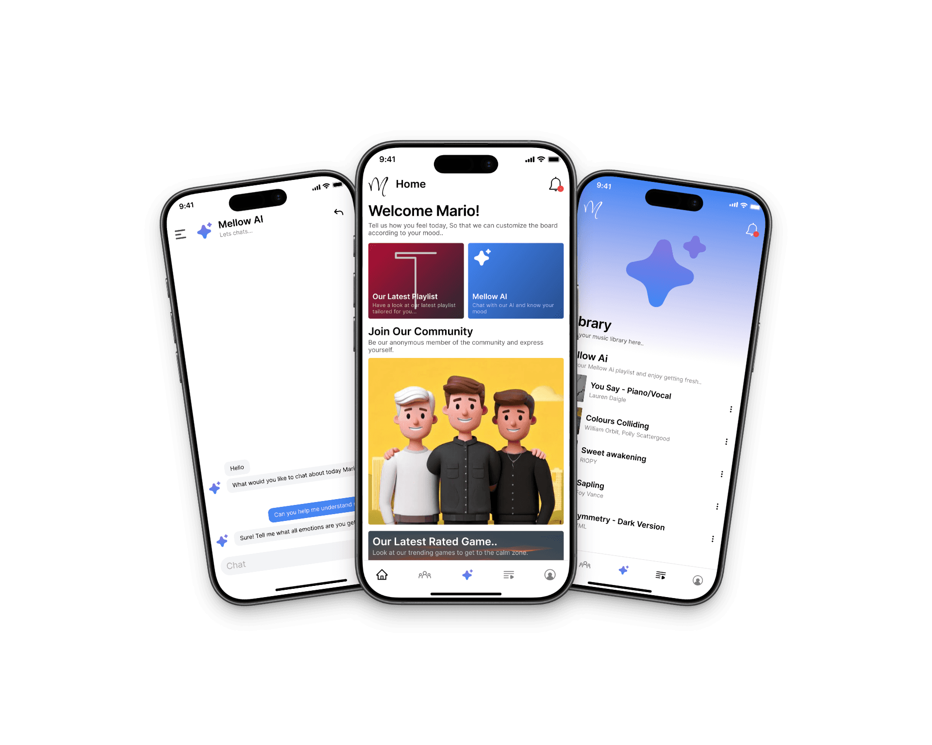
Explored how mood tracking, music therapy, and anonymous community features can support emotional self-awareness and daily engagement.
Explored how mood tracking, music therapy, and anonymous community features can support emotional self-awareness and daily engagement.
Let’s Work Together
Let’s Work Together
If you are building something meaningful, I’m all in.
If you are building something meaningful, I’m all in.
ashishshiv.upadhyay@gmail.com
Lets Connect
Lets Connect
Lets Connect